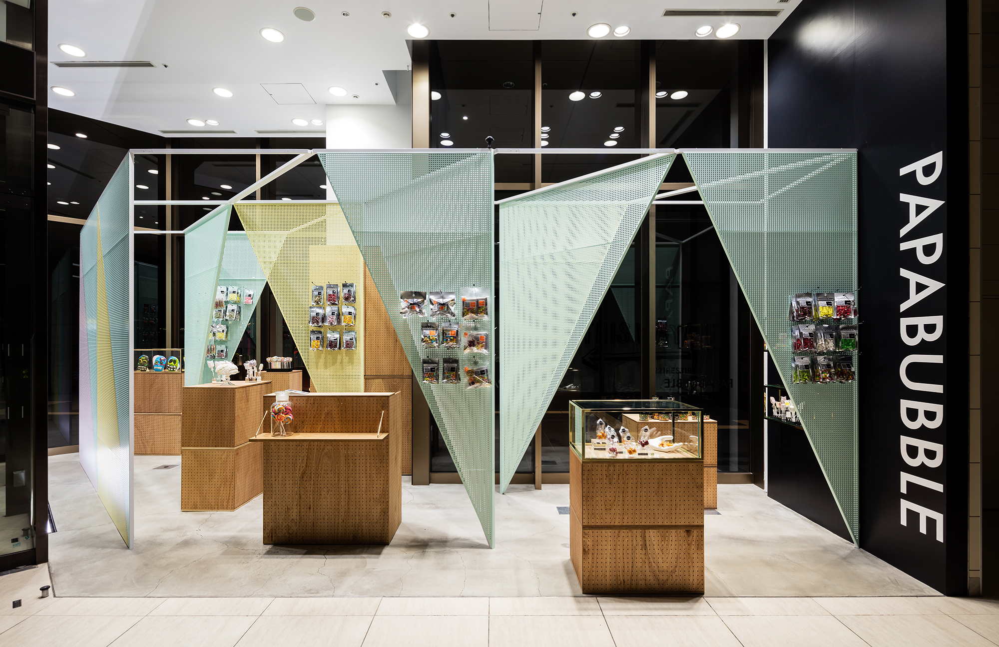
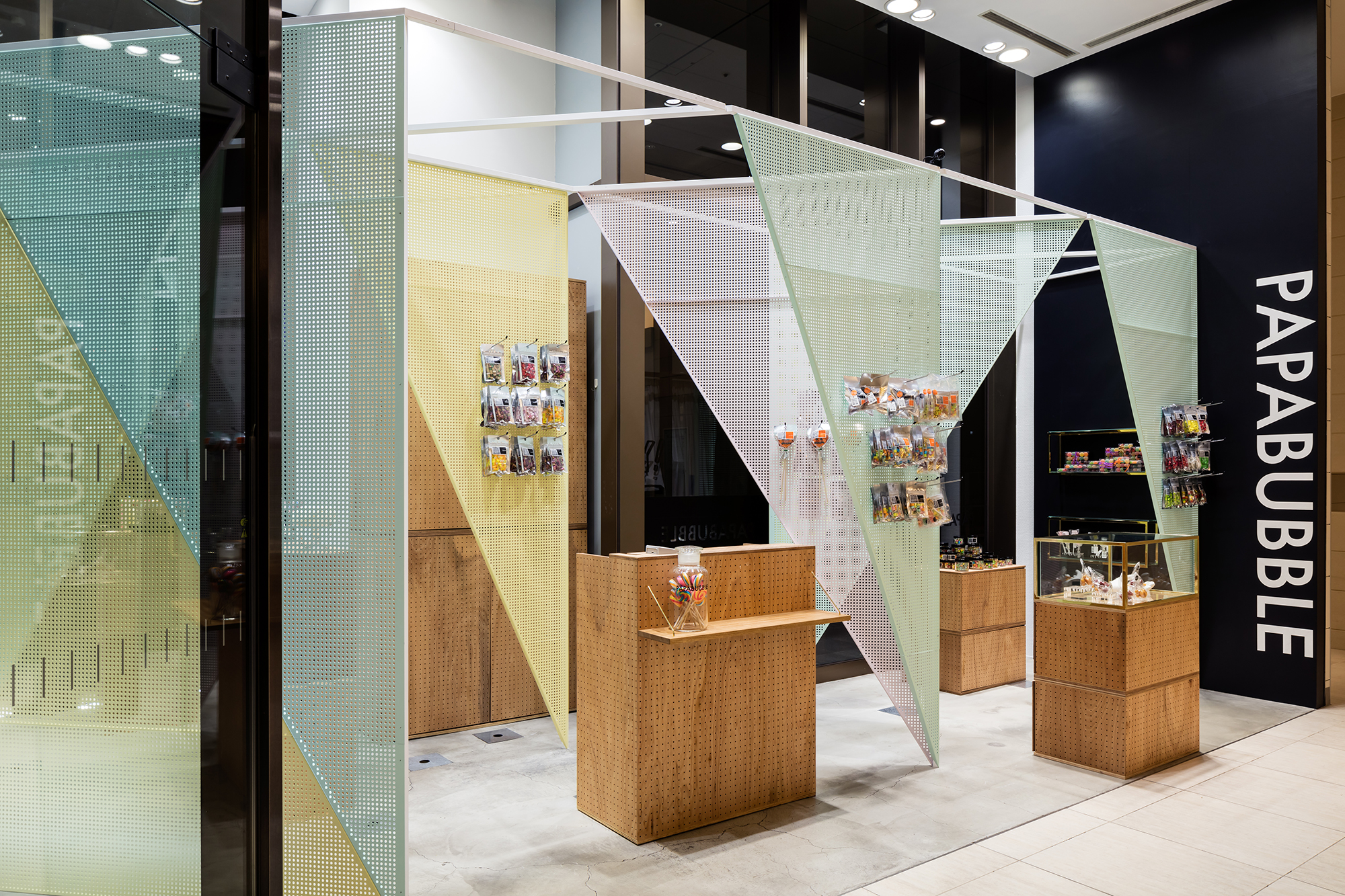
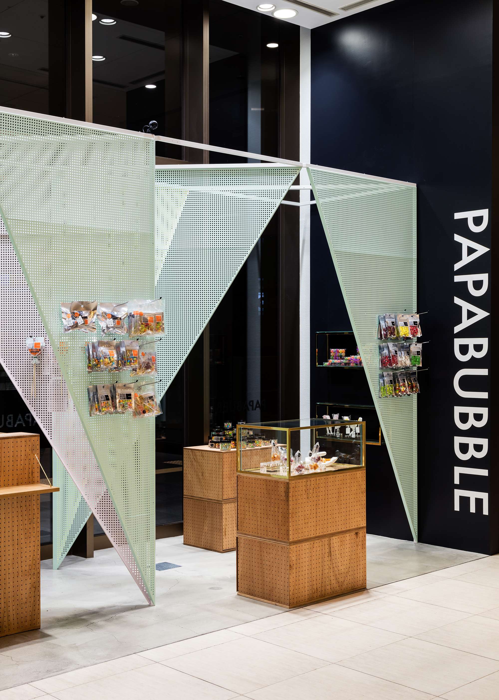
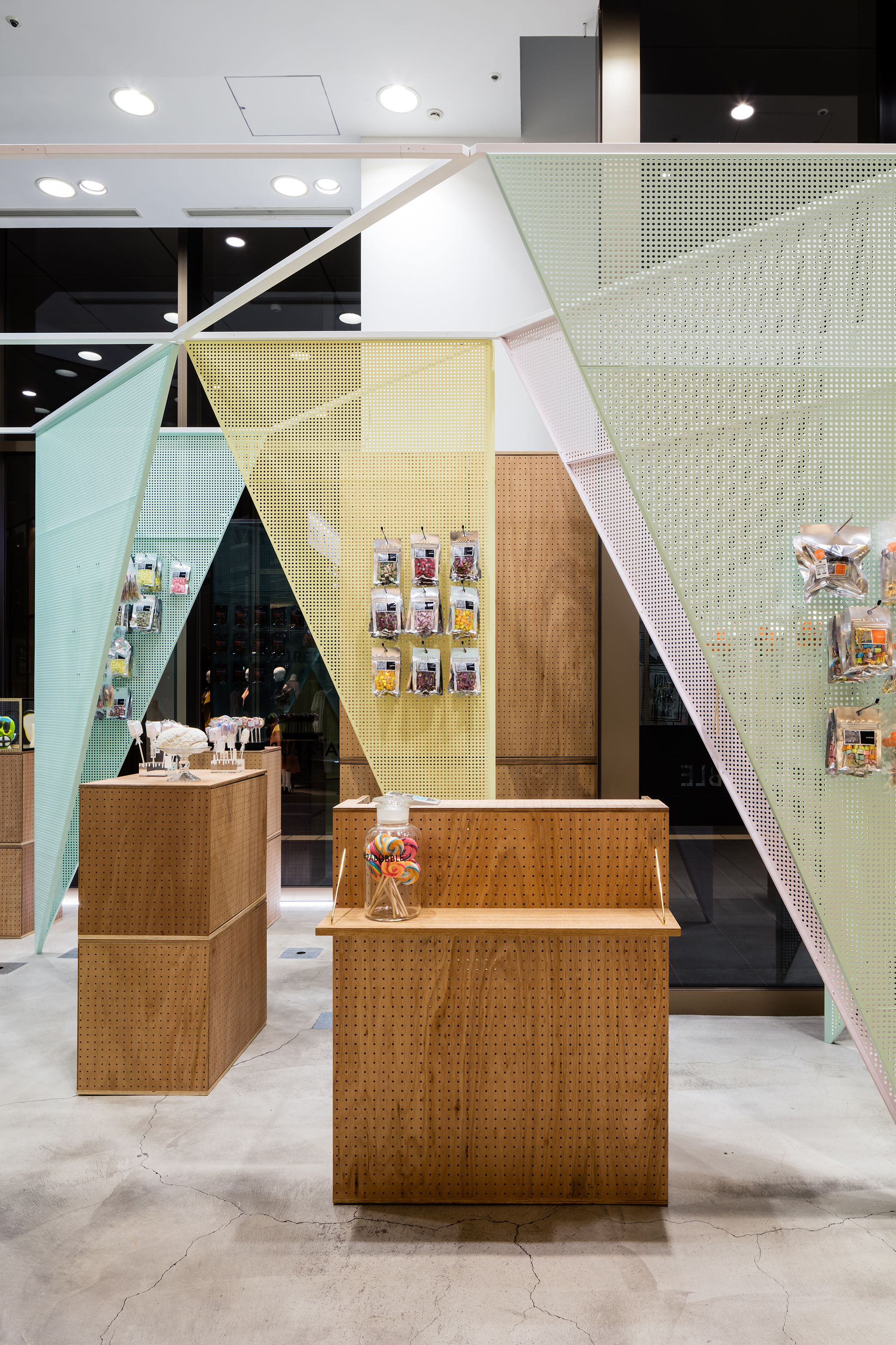
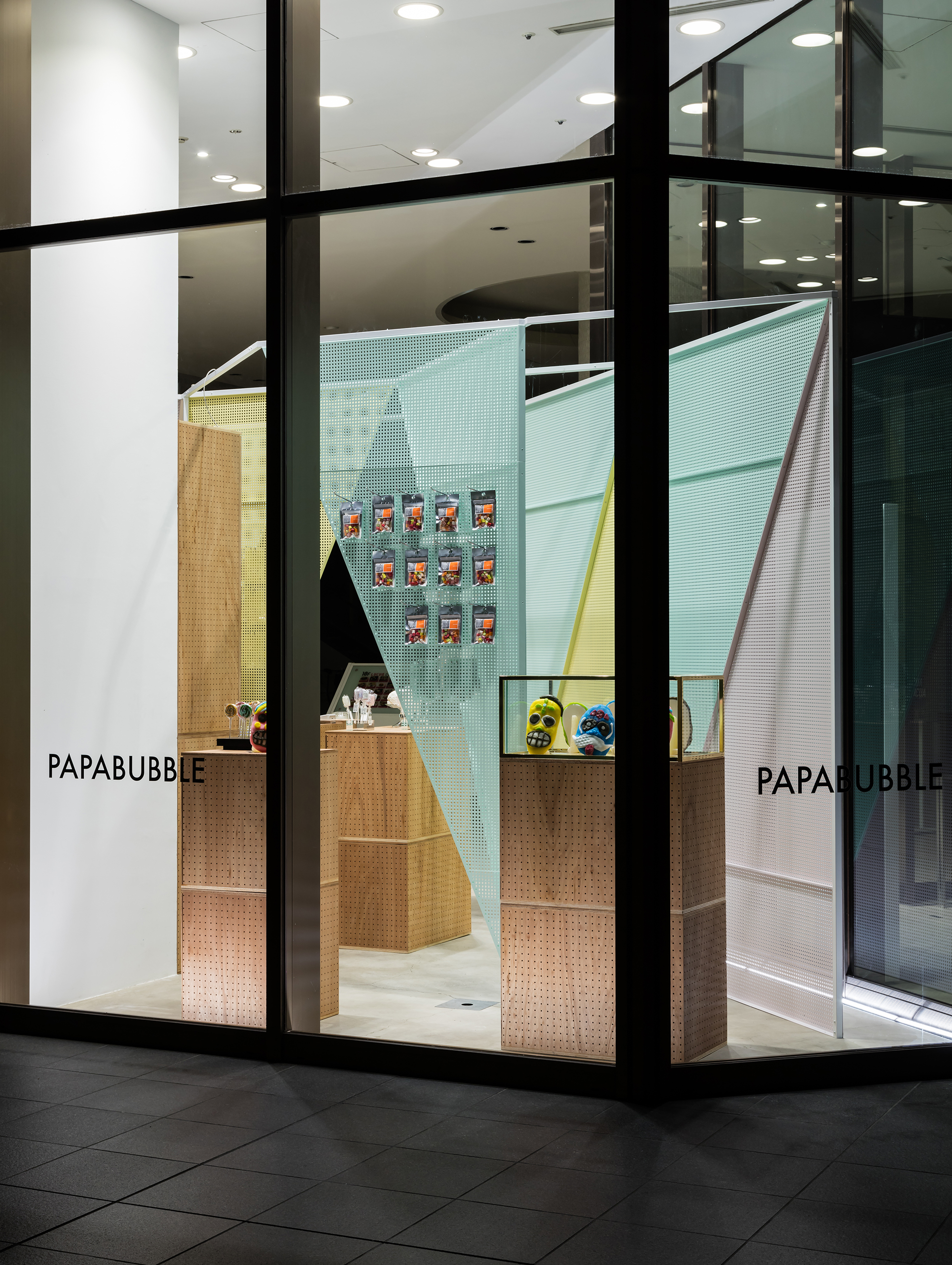
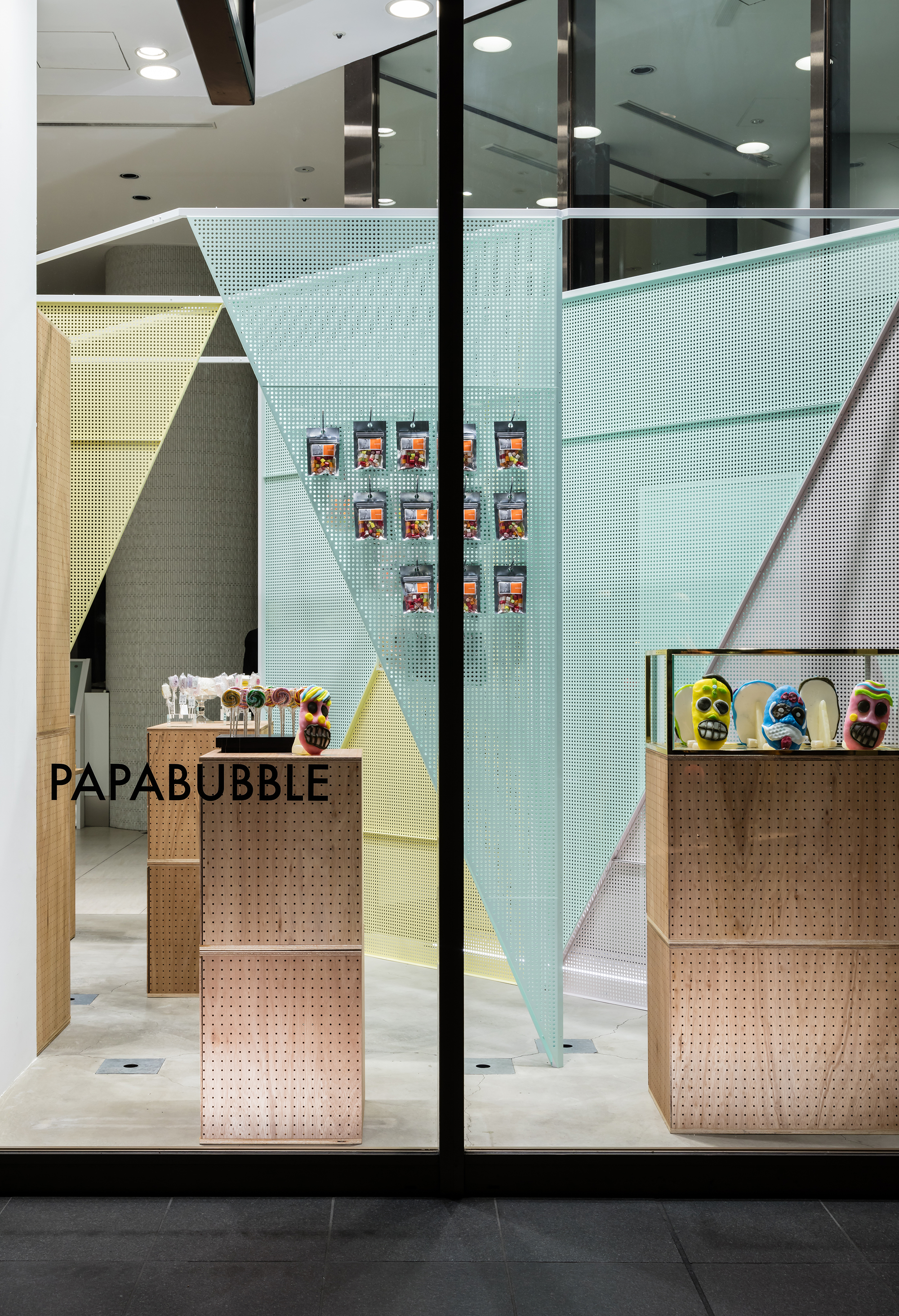
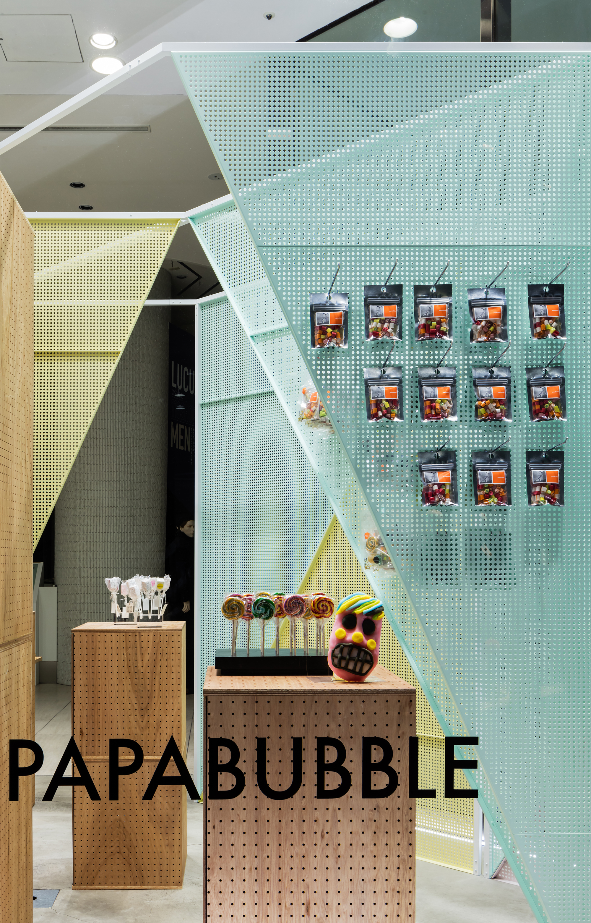
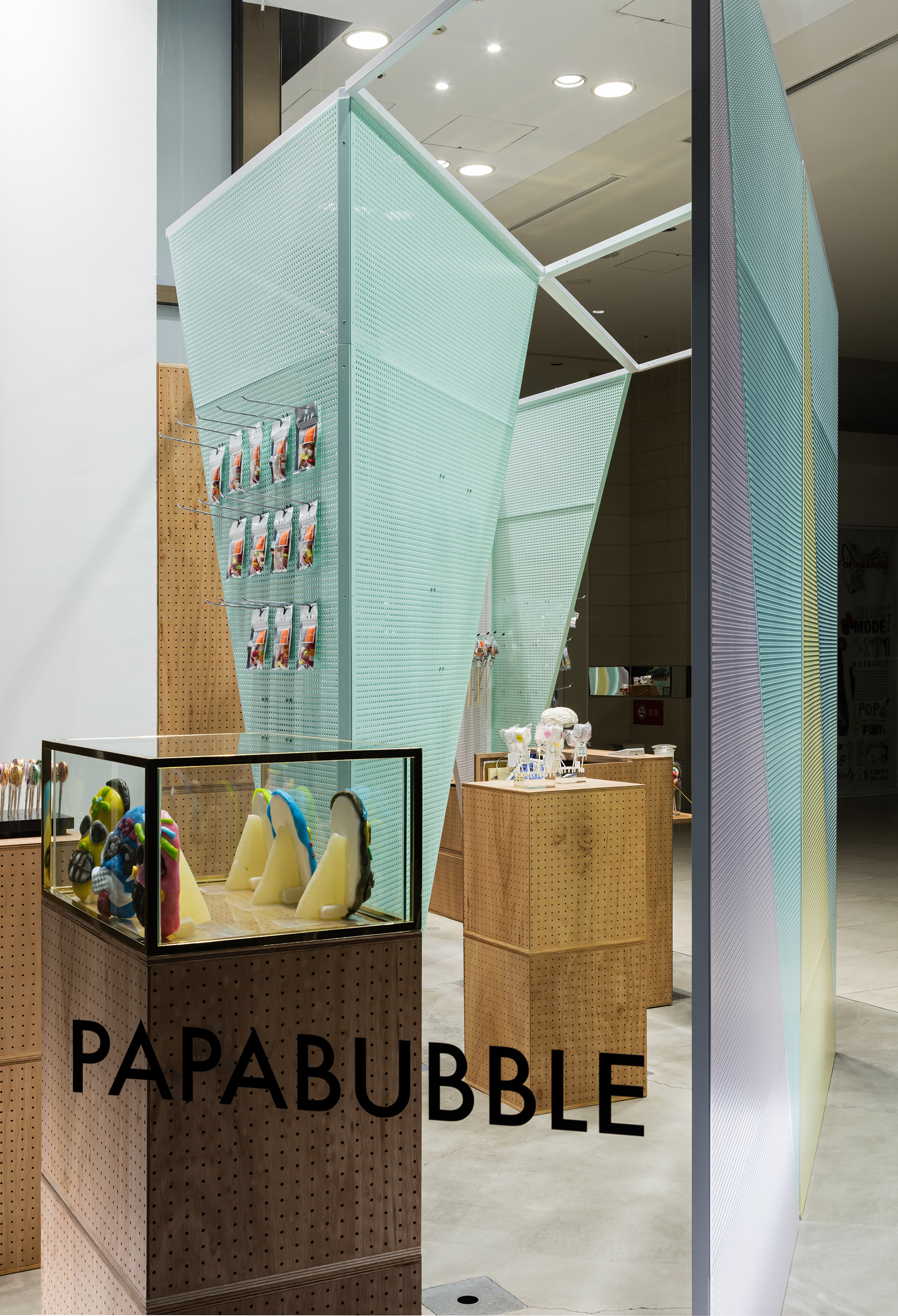
アートキャンディーを主に扱う店舗、PAPABUBBLEの再設計。この店舗は駅と多くの商業施設に囲まれ、さまざまな方向から人々が行き交う場所にある。以前我々が設計した同店舗ではパンチングメタルによる什器を積み上げて設計した。パンチングメタルにはフックを掛け、商品を展開するのに有用であると同時に、彼らのキャンディーのほろほろと溶けていく食感をイメージさせる。
竣工から数年経ち、当初はカラーリングを変更し、配置を変更する程度の更新案として設計が始まった。しかし「より自由に期間ごとの重点商品を展示したい」という施主の希望から、移動什器を主体に一新することにした。工事に伴う閉店期間を3日と最小限に抑えるために、箱型の大きな什器を並べることで店舗空間をつくり出している。
前店舗からのアイコンであるパンチングメタルは引き継ぎ、逆三角形型のパンチングメタルによる壁面を並べることで、極めて浅い店舗空間に奥行きをつくり出すことを考えた。パンチングメタルはスチールパイプで組んだ什器の筋交いとしても働く。また、見る方向や動きによってパンチングメタルの色の重なりとモアレパターンが生み出す表情が変わり、さまざまな方向から行き交う人達の目を楽しませて惹きつけることを意図した。移動什器はパンチングメタルに意匠を合わせた有孔合板による什器と真鍮フレームのガラスケースを積み重ね、並べて展開することにした。前店舗よりは色数を抑えながらも、合板やガラス、真鍮といった素材により、カジュアルさと高級感を両立させた。
Redesign of PAPABUBBLE Lucua, a store mainly dealing with art candies.
Located next to Osaka Station and surrounded by various commercial facilities, the shop is in a place where people come and go from all directions.
Our previous store design were developed by stacking parallelogram shaped fixtures made in perforated metal.
The perforated metal is reminiscent of the structure of melting candy and allowed for easy attachment and movement of display hooks, permitting the products to be presented in several patterns and styles.
The redesign was initially started as an update proposal, by changing the colors and arrangement of the parallelogram modules.
However, in response to the client´s wish of displaying showpieces and other special products more open and freely, we decided to rethink the design.
In order to minimize the period of closure to only three days during construction, we chose to design the space with movable box-shaped fixtures.
Inheriting the iconic perforated metal from the previous design, the idea was to create depth in the extremely shallow space of the store, by arranging the perforated metal triangular shapes mainly along the walls.
The triangular shape of the perforated metal plates works in favor of the structure as the hypotenuse of the triangles works as braces for the structure, supporting the top steel frame grid connecting everything, resulting in a light and simple look.
The overlapping colors of the perforated metal and the expressions created by the moiré pattern change depending on movement and the viewing direction.
The intention is to amuse and attract the eyes of people passing by from various directions.
By creating and stacking perforated plywood boxes and brass framed glass cases, we designed the movable fixtures.
The redesign uses fewer strong colors compared to the previous design, however with the addition of materials such as plywood, glass and brass, the store gives off both a casual and luxurious feel.
x Close
タト